Redesigning a Nonprofit’s Website to Match the Energy of Its Mission
My Role: Product Design (UX/UI, Design System, and Stakeholder Collaboration)
Tools: Figma + Figma Make and Claude + Claude Code, GitHub, and Netlify
Platform: Desktop and Mobile
Timeline: Summer 2026
What’s Your Passion?
YourPassion1st (YP1st) is an Oak Park nonprofit founded on a mission to connect young people with jobs, mentorships, workshops, and hands-on events in Chicago that match their passions. The organization serves two primary audiences: young adults seeking career and skill-building opportunities, and business owners and entrepreneurs seeking out talent. The website refresh was a great way for me to engage with my community while also folding in AI throughout my design process.

Modernize & Optimize
My main objective was to create a responsive site that looked great on both desktop and mobile. With outdated visuals and unclear navigation, YP1st’s current site needed a UI refresh that considered how users engage with the site. My challenge was to identify pain points for current users and bring a fresh visual language to the site while still reflecting the nonprofit’s energy.
Start, Stop, Switch
My first few tasks were rethinking the site’s information architecture. Doing a heuristic audit, I found opportunities to improve the site's overall structure by updating its nomenclature and taxonomy.
Next, I focused on optimizing user flows to ease task completion and create a more frictionless experience. With some light research assistance from Claude, I then looked into current trends in the nonprofit sphere, focusing on youthful, modern visuals. My initial refresh proposed a site presented in default dark mode. However, this presented my first big challenge: getting all stakeholders on board with a complete overhaul of YP1st’s current branding. Realizing after initial meetings that the current branding was not budging, I split the project into two phases:

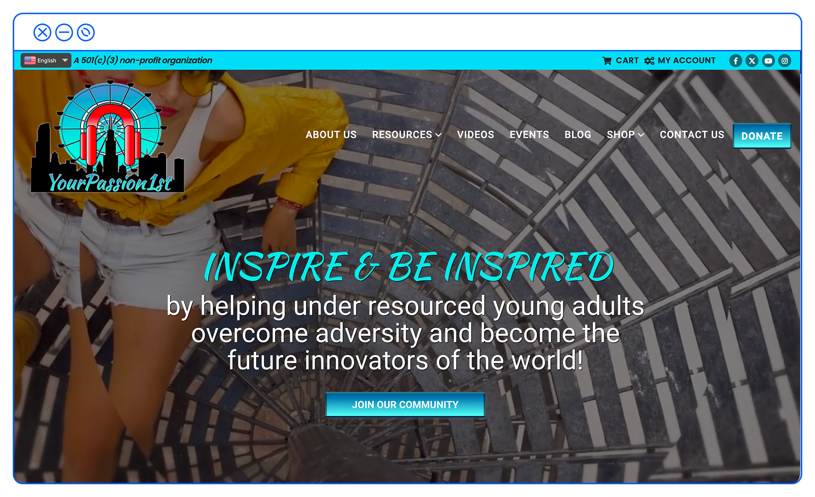
Dark Mode Deactivated: The initial homepage for desktop and mobile set in default dark mode, along with a new logo that the client rightly felt was too cold and corporate.
Realizing after initial meetings that the current branding was not budging, I split the project into two phases:
Phase 1: Focusing on overall site usability and a refined UI aligned with current trends and best practices, I prioritized a modernized digital experience while working with the current logo and brand colors. Knowing my design would be coded into a customizable WordPress template, I created a design system with scalable components and patterns so contributors could update the site while preserving the integrity of my scope.
Phase 2: Once the new site was up and running and we could look at site analytics, Phase 2 could begin. This sprint would involve a full brand refresh while iterating on the current site and user flows to further optimize users’ journeys and strengthen the visual design.
The homepage got a complete overhaul, with navigation, content display, and actionable CTAs. The original site had disorganized, unclear navigation for users who wanted to explore both the organization and potential job opportunities. I grouped pages into categories so visitors could easily find what they needed—whether it was a particular event or how to donate. To create a robust dropdown main navigation, I also included simple summaries of each page within the dropdown menu, so it was clear what you were about to click through to. CTAs were also a bit muddy for users throughout the site, with unclear language. I wrote clear, clean, simple CTAs to remove ambiguity.

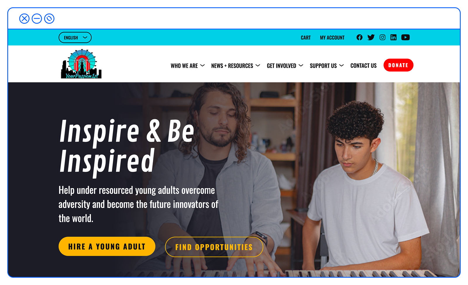

Fresh New Homepage: The redesigned homepage features hero brand photography instead of the video loop that triggered on visit, making content easier for users to scan.
Almost all pages on the site lived independently of each other within the site’s existing top navigation. I grouped similar pages into categories that made up the main dropdown menu, so anyone accessing the site could easily find what they needed.
Perfecting Finding the Perfect Event
The homepage is built as a series of modular content blocks—a pattern that lets me mix and match sections for future pages without starting from scratch. Based on stakeholder feedback that users engage most with YP1st's newsletter and hosted events, I spotlighted those elements in the site refresh. The Events page was a drag-and-drop page with large, content-dense flyers and an imported shared Google Calendar. I created an Events page focused on weekly events, with the option for users to drill down into individual days and specific events, while keeping the calendar easily accessible.


Scannability Prioritized: By creating a content hierarchy for the Events page, users can now easily scan a week of offerings, with each event on its own subpage that includes more information, links, and flyers.
Posting an Opportunity with Minimal Clicks
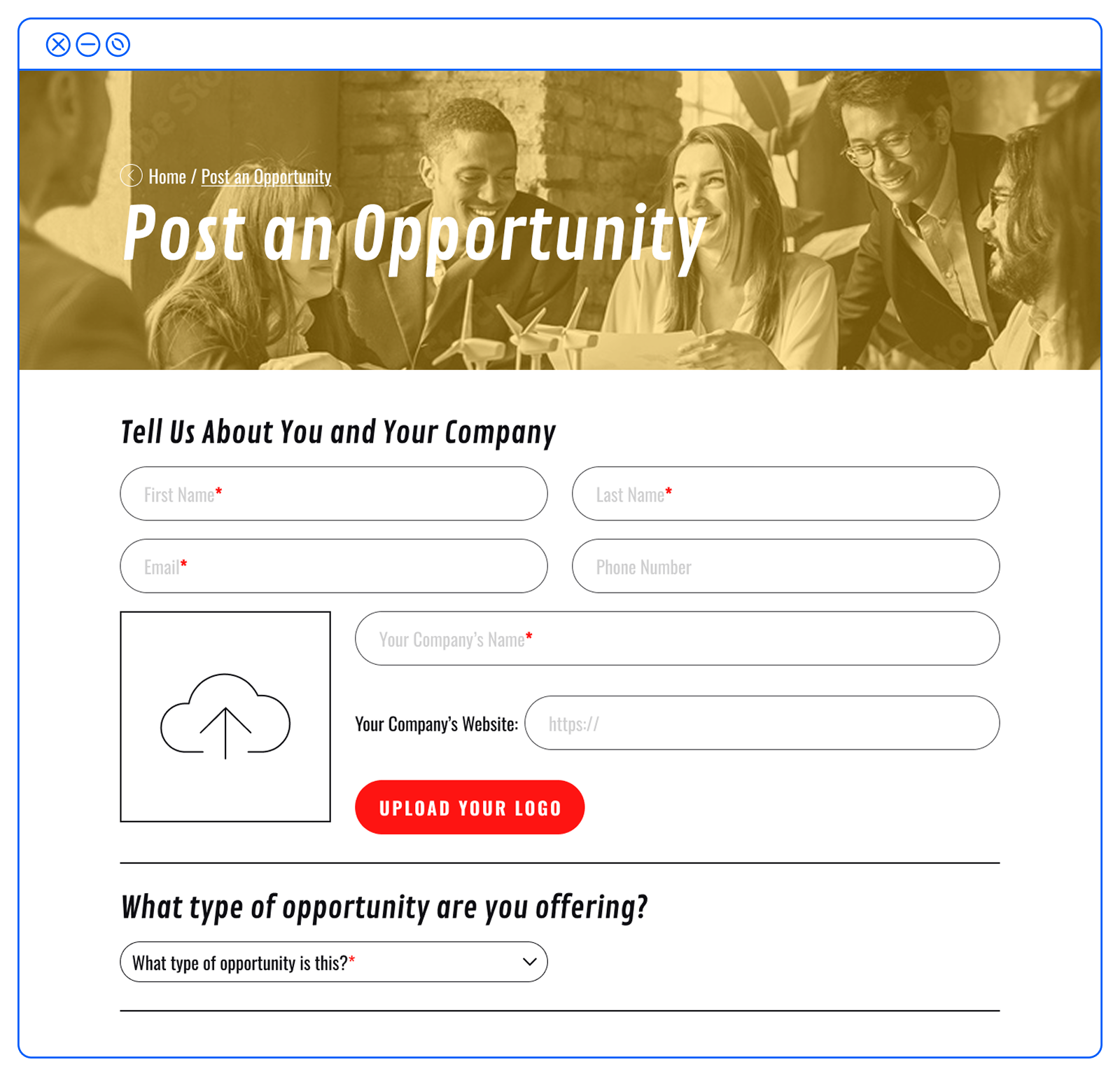
Initially, if a business owner wanted to post a job, they had to complete a Typeform application. My solution was a dedicated form page for users to upload all relevant job information. Removing the friction of clicking through a third-party form not only legitimized the job posting process but also streamlined how employers find a job candidate.
In addition to the site refresh, I reworked the bi-weekly newsletter to complement the site’s new look and improve the overall user experience. The original newsletter, much like the site, had confusing CTAs that needed some love, along with text formatting that enhanced readability on both desktop and mobile.
A Design System That Scales, Simple User Flows, IA That is Clear

While building a responsive site in Figma, I created a library of components, icons, page templates, and modules for easy reuse across the site.

Drag and Drop: YourPassion1st’s design library that I created to work throughout the site, with easy scalability for future builds.
Prototyping with AI for Effortless Clicks, Scrolls & Feedback
First, I created a conventional Figma prototype that stakeholders and testers could click through. However, with Claude Code, I collaborated to create coded templates, components, and tokens locally to test before pushing the buttoned-up code to GitHub, then deploying it to Netlify, where I created a custom URL I could share with both parties for feedback. The fully coded site also served as a source of truth for our developers, who could review interactions, flows, and UI, supporting the final dev handoff
Working with both Claude and Claude Code, I enabled Claude to create additional pages I hadn’t designed, all based on the existing design library. This not only saved hours of tedious work, but also allowed me to iterate on layouts quickly so I could see what would work best for ideal users.
Accessibility was also an AI collaboration, this time with Figma’s AI agent. I could share screens, get actionable feedback, and update designs to comply with Web Content Accessibility Guidelines (WCAG).
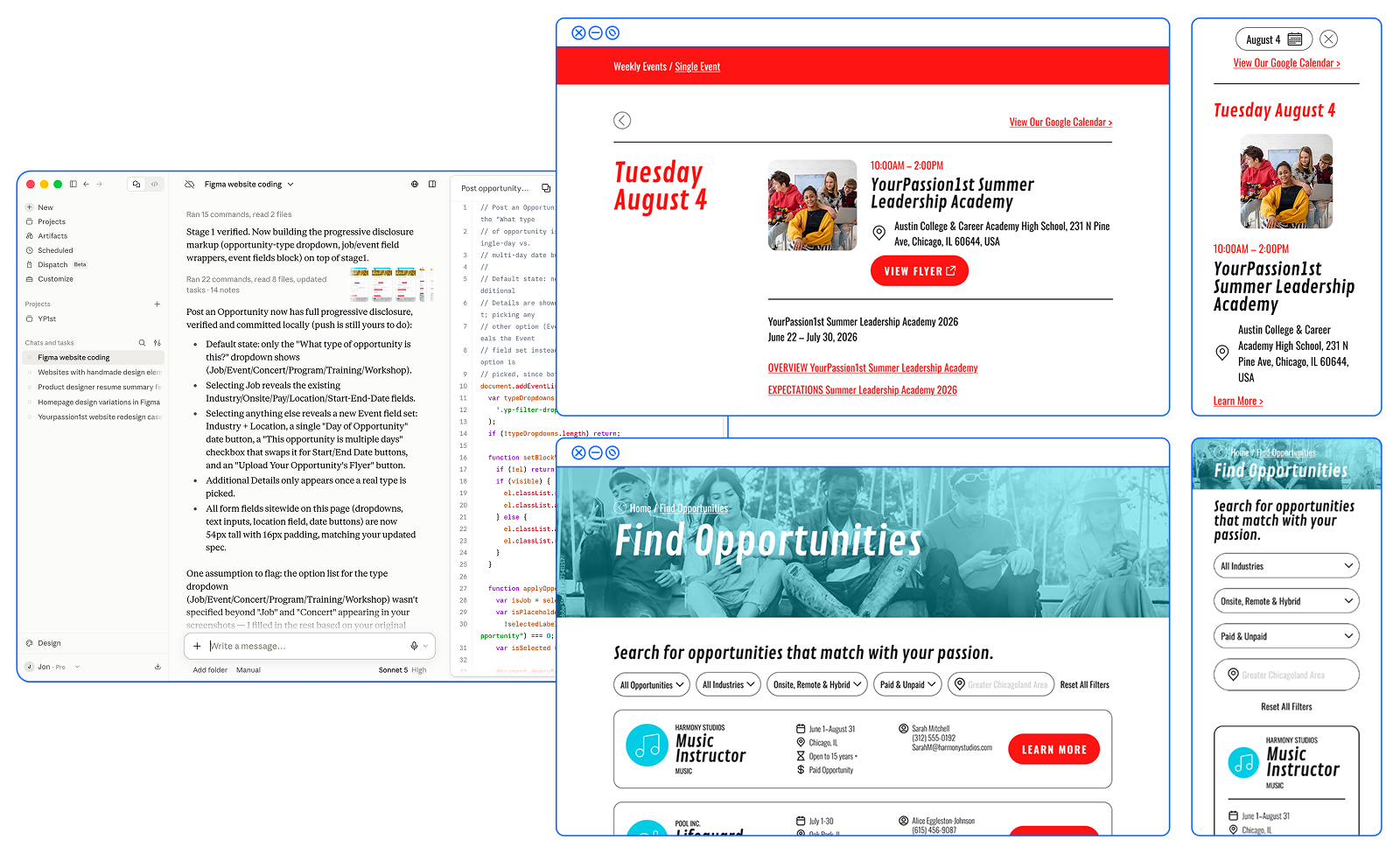
Step by step: While far from perfect, Claude Code let me build the entire responsive site, making updates easy based on testing and stakeholder feedback.
While a complete brand and site overhaul had to be split into two phases to ease the client into branding updates, Phase 1 was a great opportunity to create something meaningful while collaborating with AI tools. To kick off Phase 2, I created two additional branding options, plus the initial direction I recommended (with some tweaks), for YourPassion1st to consider, along with visual applications for each option.
Future Considerations
The first option is cheerful, modern, and forward-thinking. An overall rebranding that is clean and optimistic, emphasizing the excitement of a job that matches specific passions while also emphasizing the big-city feel of Chicago. The website features a bento-box grid layout, offering endless content and messaging configurations while emphasizing lifestyle photography.
Option 1: Positive + Progressive


Above is cheerful, optimistic visual inspiration, along with a refreshed, cleaner logo based on YourPassion1st’s existing logo, featuring friendly colors and typography. These brand elements are applied to a modular homepage option.

With an emphasis on technology, option 2 focuses on the future with a clean, content-forward, sensible design. Think brand experiences for banking, fintech, and SaaS companies, while staying Chicago-centric. Branding and its application are clean and more information-heavy, while still featuring bright and clean visuals.
Option 2: Innovative + Trusting
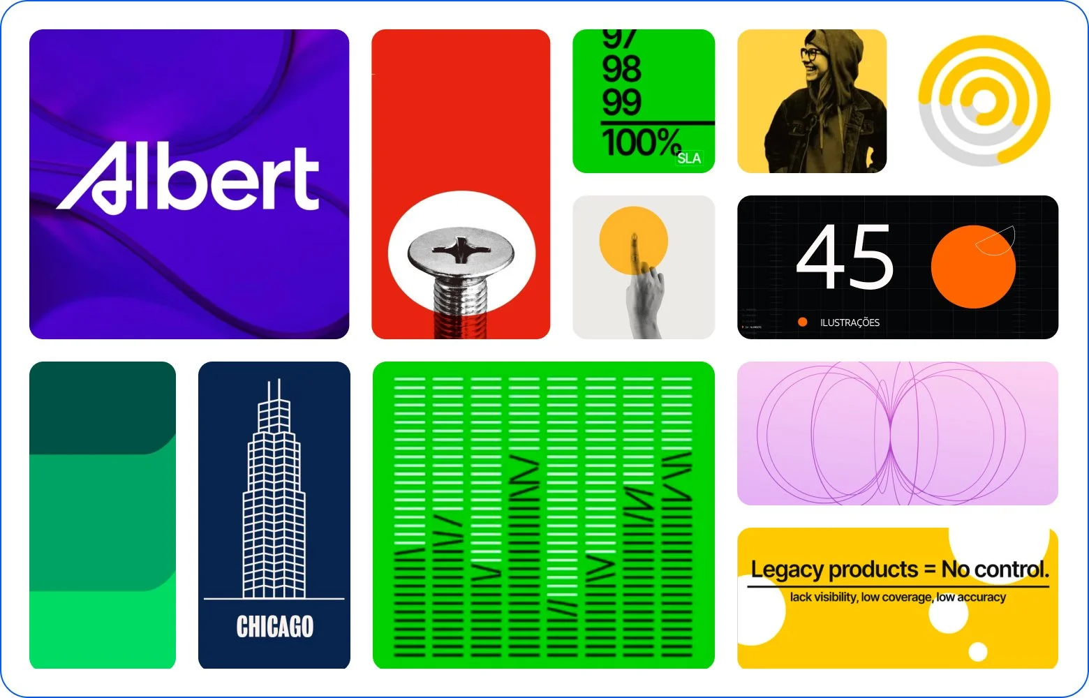

Inspiration and branding are technology-focused, with a cleaner logo featuring the Chicago skyline (a riff on the existing logo) along with a few Chicago landmarks. The homepage is more focused on information and stats without losing the organization’s youthful charm.

With a modern, young, and friendly feel, this third option offers a relaxed, humanistic touch while still creating an encouraging experience for matching users’ passions with real-world opportunities. This direction was the initially proposed direction, which was a dramatic jump from the nonprofit’s existing branding.
Option 3: Youthful + Innovative


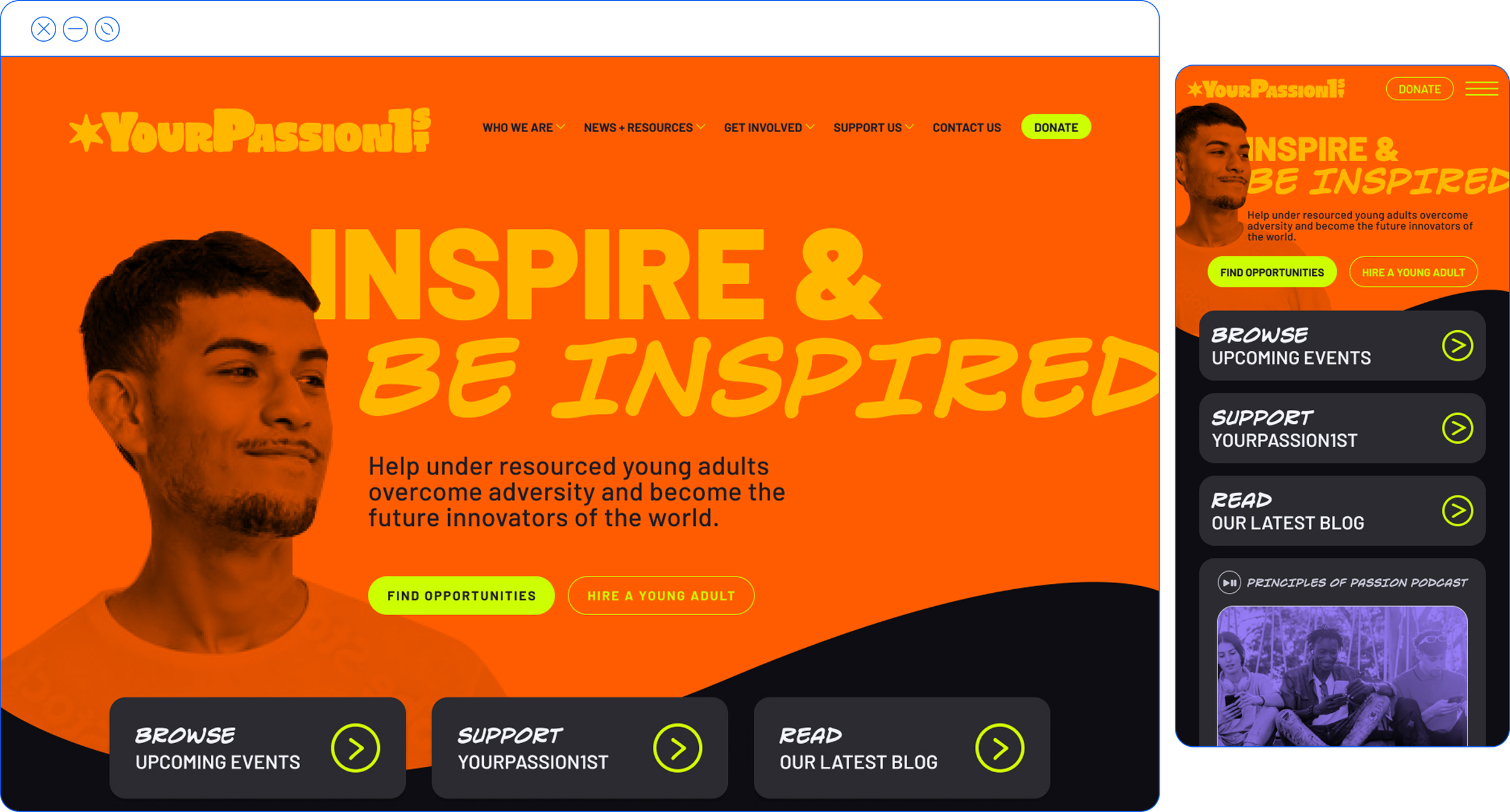
Inspired by handmade visuals and bright neons, the homepage appeals to its young audience through bold, personable typography, color choices, and a logo that feels more organic than the previous two brand directions.