

My Role: UX Design, Research, Concepting, Prototyping and Wireframes
Tools: Sketch, Illustrator and Axure
Platform: Desktop
Timeline: 4 weeks
The Challenge: WeWork approached us with a unique opportunity to bridge WeWork businesses and nonprofits around the greater Chicago Area. WeWork wanted to launch a product that would connect WeWork members with community nonprofits by finding the right match between the nonprofit’s and volunteers in a way that would maximize the volunteer’s time.
Our Users: We sought out and talked with the members of WeWork as well as nonprofit experts. At first we talked to three users who were all female and in their mid-20s to early 30s. One was self-employed while the other two users were employees of businesses in WeWork. All of them have been at WeWork between one to four months. All three of these users shared several common factors:
All members were fairly
new to WeWork and they were
active in volunteering
Camaraderie and community
building was important to
everyone we interviewed
WeWork’s digital platform
lacked activity and curation
for an enjoyable experience

Primary Persona: All of those insights translated into our primary persona: Courtney, an outgoing, big-hearted team leader. As a new member of WeWork, one of her goals is to meet her neighbors and attend some events. She also wants to market her company, given the open environment that she’s in. She also would love to get her coworkers interested in volunteering together in order to build some team camaraderie. However, there are a few roadblocks to accomplishing her goals. The first is that, digitally, the WeWork app doesn’t help her to reach out to others. And physically, this is reflected in that people aren’t social within WeWork. She also wants to volunteer, but it’s hard to spend time looking for an opportunity when her time is limited.
Following our first round of user interviews we realized we needed to get a fuller picture of WeWork members, so we then conducted our second round of interviews. This time, we got four users, two females and two males. Three of them are small business owners of a one or two person team and they all had been at WeWork for four months or less. Three of them were constantly on the go for their job and would both work remote or at their WeWork office.
The three most interesting facts we gleaned from this second group of users were:

75% of the users weren’t
actively volunteering
in their community

Users were more likely
to volunteer if they had
an incentive to do so

They tended to reach out
to nonprofits when it would
benefit their company

Secondary Persona: With all this new information, we needed to create a second persona who was more reflective of WeWork members we interviewed. Dan, our secondary persona, is an agile, opportunistic business owner who wants to develop a Chicago-based network. Dan wants to successfully launch his small business and connect with organizations with similar interests here in WeWork for good PR. However, his frustrations are that he can’t strategically network with businesses in WeWork due to the social inactivity and he is new and unfamiliar to the volunteer process.
Now that we had two personas, we moved on creating a product that would help new WeWork members that feel disconnected and need a way to easily engage with others through volunteering because they want to foster community so they can facilitate team-building and promote their company.
Guiding us in our designs we then crafted four design principles:
Welcome Aboard: Get the user quickly acclimated to the platform and to be able to start interacting immediately.

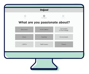
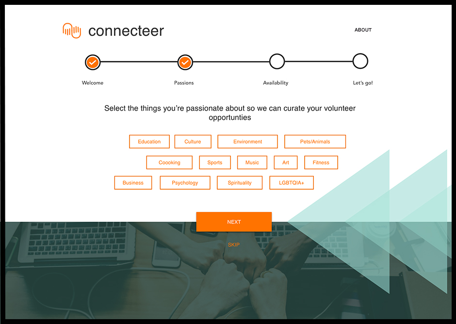
Passion Points: Cater to user’s passions. Keep the information lean and specific to the user and their interests.
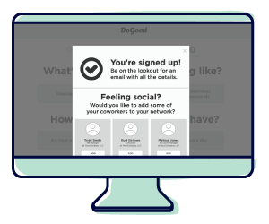
Me to We: Foster community engagement by encouraging people to share their experiences.

Everyone Wins: Build trust by guiding the user through the experience, from discovery through impact.
Concepts
Knowing what the problem is and being equipped with the design tools, we set out to create three different concepts to come up with potential solutions.
Connect the Dots
Filterable options and networking
Field Guide
Step-by-step guide for users

Rubber Band Ball
Easily invite coworkers to join
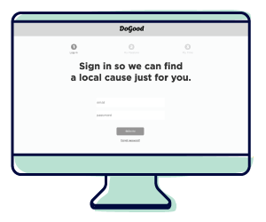
When we put these concepts in front of members, they provided insightful feedback. Across the board, users seemed to really enjoy checking out profile pages of nonprofits and other WeWork members. This allowed them to get more familiar and build trust before connecting. Users also responded well to the checklist. Simplified the process of volunteering, particularly for unfamiliar users like Dan, gave our users a sense of accomplishment and purpose. The quick on-boarding made it easier for users to begin volunteering right away, plus users really liked that they could tailor their interests to what nonprofit they wanted to connect with.In terms of platform, we kept that ambiguous and let the users decide. Unanimously they all felt that they would use the product on a desktop, rather than download another app to their smartphones.
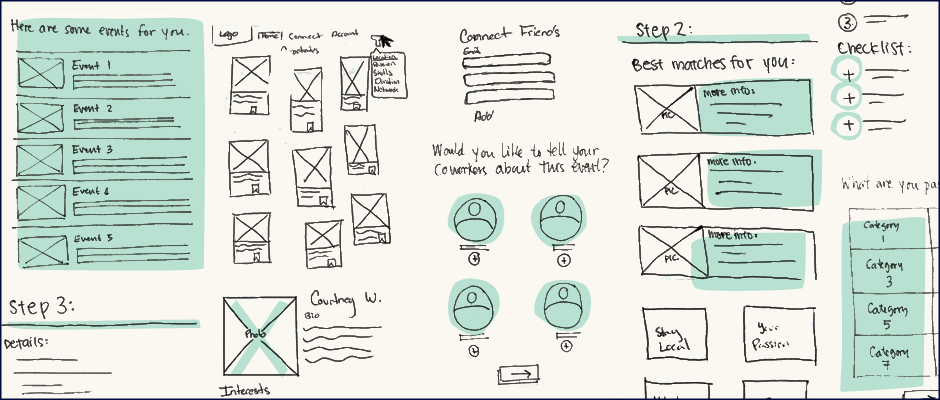
Sketch it out: Series of iterations my team and I did to run through potential screens for our prototype.
After hearing the feedback, we understood that users loved the simplicity of Rubber Band Ball and so we moved forward with removing any unnecessary and confusing features of the concepts. From that emerged the creation of our final product, which we named DoGood. DoGood strives to selectively filter and guide users by partnering with a nonprofit that suits their interests and schedule while also connecting them to other members with similar passions. Together we created a clickable prototype that we could test.
Sketch it out: Series of iterations my team and I did to run through potential screens for our prototype.
After putting this in front of users one feature they all reacted positively to the social features. Whether it was being able to connect to other WeWork members, fellow coworkers, nonprofits’ profile pages, as well as being able to utilize social media to promote themselves and their businesses, users were drawn to being able to connect to others. WeWork members’ profiles were the most popular users were allowed to learn more about the people they often spend a good majority of their day around but hardly knew their personal interests. Another feature, suggesting events to users, allowed them another social opportunity—being able to talk to other WeWork members about volunteering events within their WeWork neighborhood. Users also preferred to have the option to invite other members immediately upon signing up for the event, which further facilitates community among nonprofits and WeWork members.
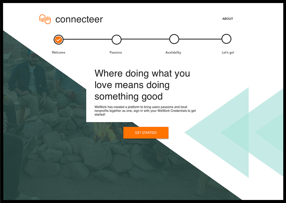
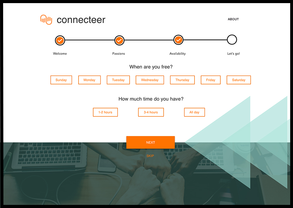
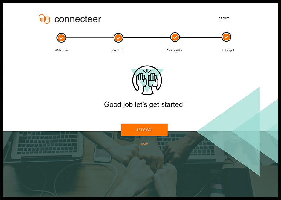
Following our prototype, we then passed off our annotated wireframes to the UI team, where DoGood was rebranded as connecteer with a much more fine tuned user experience along with a completely branded visual system.
Sketch it out: Series of iterations my team and I did to run through potential screens for our prototype.
Moving forward, and before launching connecteer, we recommended putting the product in the hands of as many Chicago-based WeWork members as possible to improve functionality and get a solid grasp on preferred features of the website. We also recommended rolling out the platform to nonprofits so they can get feedback on features, like the checklist for tracking volunteers’ progress. Another future recommendation is to consider building a complimentary app, depending on how successful the website is.