

My Role: Product Design, Concepts and Branding, Prototyping, Wireframes and Testing
Tools: Sketch, Illustrator, Zeplin and InVision
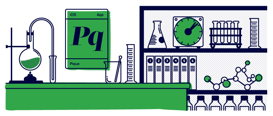
Platform: iOS
Timeline: 1 year
It’s human nature for people to want to live their most fulfilled life—a life of deep personal connections with challenging goals and meaningful moments.
To help us on that path most of us have probably bookmarked an article on mindfulness, subscribed to a podcast about creating good habits or even thrown a book about attaining true happiness into our Amazon order. How many of us, though, have actually followed through and returned to the article, listened to the podcast or read the book and applied it to our lives? Instead of tearing yourself down because of a lack of follow-through, it’s important to remember that it’s hard to be human. With that in mind, a small group of people had a potential solution.
Founded by a professor of Behavioral Science and a Social Psychologist, Pique utilizes Behavioral Science findings and curates them as three-minute adventures users can quickly and easily accomplish while they, for example, wait in line at the grocery store. Instead of having a book on finding happiness taunting you from your nightstand, you can do quick and meaningful adventures from your phone in just a few minutes. While that short amount of time seems negligible over time these curated adventures add up, with goal-building in mind.
When I came onboard the founders were certain of three things they wanted Pique to be:

An app that was completely different
than what was currently available

An app that would deliver context-based content based on a foundation of Behavioral Science studies

An app that presented its
content quickly and quirkily
Pique offers users activities to complete via the app that are based on Behavioral Science. We named these activities “Moments”. How to organize and deliver these Moments was the top priority for the build up to our beta release.
To help us with the production and organization of these Moments we decided to break them into four sections: Warm Up, Nested Moment, Behind the Science and Wrap Up. Each Moment started with a Warm Up, which involved a quick animation or interactive element that set the tone and eased the user into the Nested Moment. The Nested Moment is the bulk of the entire Moment and is where the user goes through the exercise based on Behavioral Science. Once that exercise is complete the user moves onto Behind the Science, where they learn about the real world studies that the Moment is based on. The Wrap Up allows the user to make notes, bookmark the Moment and to reflect on how they can continue to use the learnings of this particular Moment in their life.
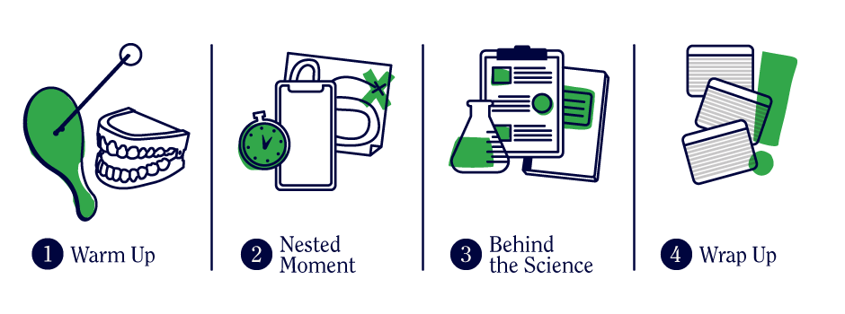
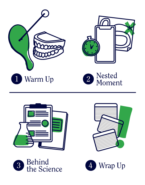
Step by step: Breaking each moment into sections helped streamline their creation, as well as create steps of familiarity for the user.
How do users know when a particular Moment is available? We utilized push notifications that let users know a Moment was ready for them to experience. Initially all Moments were context-based, meaning we needed users’ permission to access their location, as well as permission to allow push notifications. While ideally this sounded like a good idea, users were hesitant to give up that amount of access on initial sign-up. So, we opted for Moments that were thematically-based.
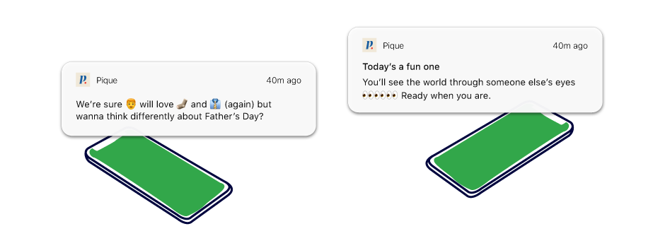
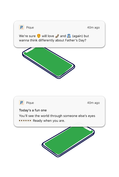
Friendly alert: Push notifications for a Moment about Father's Day and another for a Moment based on perspective-getting.
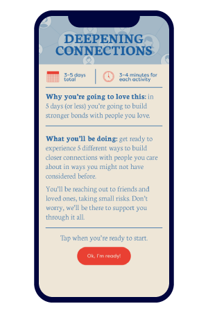
We went even further to group these Moments into Journeys, which we defined as a set of Moments with an overarching theme and a similar end-goal.
For our initial beta release we created a Journey of five Moments centered around deepening connections with friends and family. Users were allowed to complete three of the five Moments in one day and then, via push notifications, were alerted when the final two Moments were available to complete.
To familiarize users with the concept of Journeys we created a screen after onboarding that explained the duration of the initial Journey, along with letting users know what they could expect to experience and gain through their Journey of five Moments.
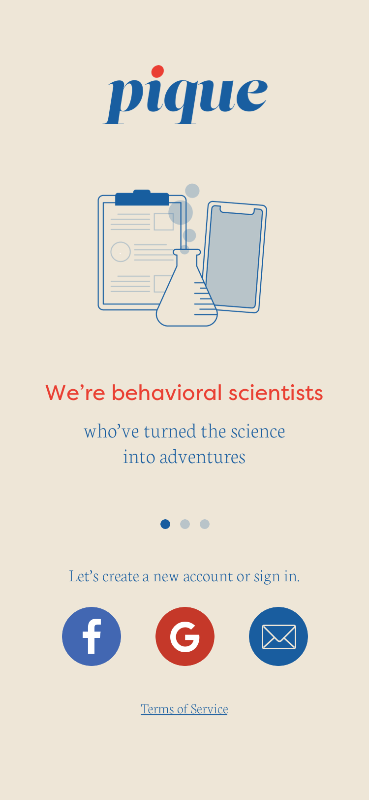
From the get-go all stakeholders wanted the brand to relay a sense of fun while teaching its users through actionable activities within the app. One of the first things I tackled was branding for Pique. Pulling inspiration from vintage games and textbook covers I created branding that relayed fun and learning while also being modern. Everyone wanted Pique to stand out among the other apps in the health/wellness realm.
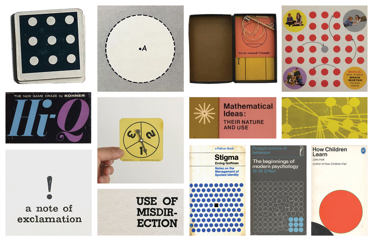
Brand inspiration: Inspired by vintage textbooks and games I created branding that put a fresh spin on these classic design elements.
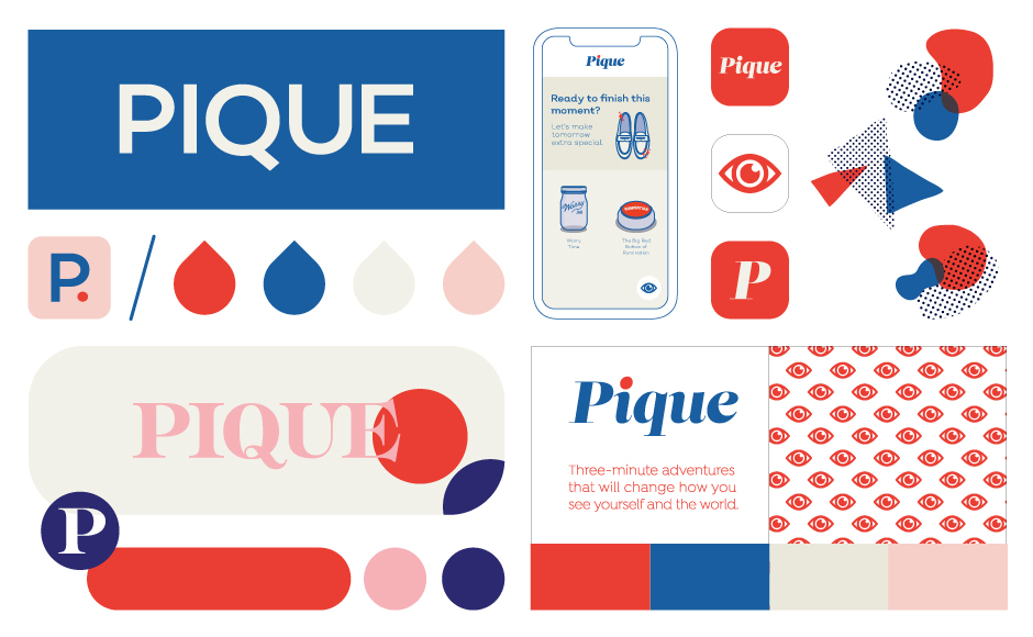
Brand exploration: I considered several solutions for brand iconography, colors, typography and even a homescreen mockup.
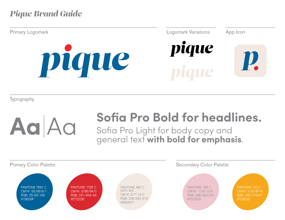
Primary logomark and brand guide: modern, but with a nod to typography of the past, I created a logomark that stayed true to Pique's playfulness and modernity. To keep the branding consistent I also created a brand guide one-sheet detailing logomark variations, typography and brand colors.
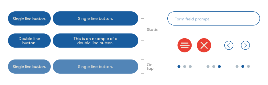
To keep style and visuals consistent I created a style guide, as well as a library of components that included icon illustrations, buttons, fields and navigation.
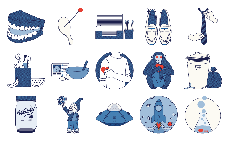
Personality was injected into Pique via dozens of custom illustrations that were used throughout Moments, as well as for loading screens between activities within Pique. Below is a fraction of the illustrations I created for the app. I also worked with a digital animator to bring many of these illustrations to life.
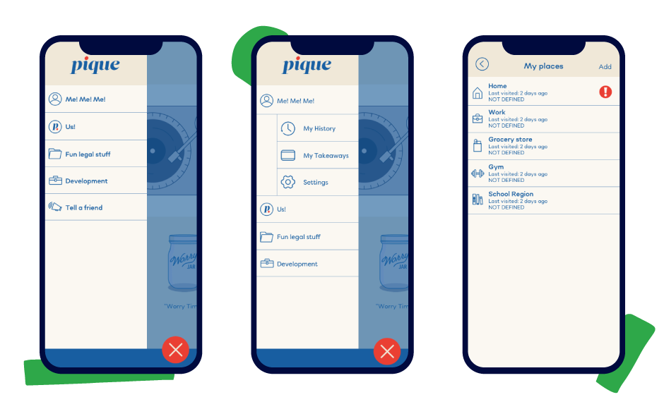
Additionally I crafted a series of icons to be used for both homescreen and menu throughout the app. Screens were uploaded to Zeplin so our dev team could access all icons for implementation.
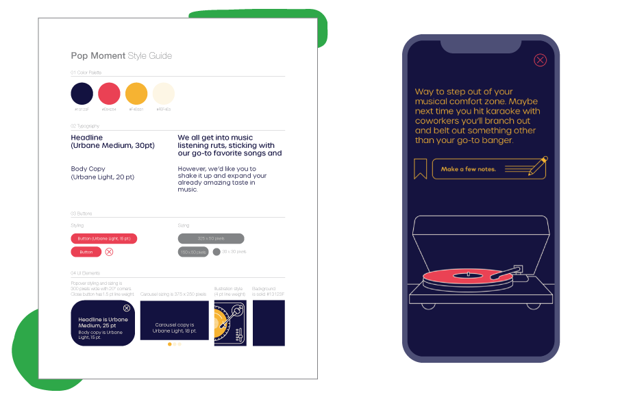
Each Moment was originally given a specific set of visuals. For example, a Moment that might deal with sensitive subject matter would get a softer, warmer color palette and typographic treatment. Another Moment, with a lighter tone, would get punchier colors and a fresh set of type choices.

Initially the onboarding process started with creating an account. However, after testing with users we discovered that a few screens giving a quick overview of Pique would inform users what exactly Pique would do for them. In the first beta version of the app we asked users to turn on both location and notification permissions (image below). However, users suggest that we introduce that later and let them experience the value of the app first so they could gain trust before we request permission to ping and keep tabs on their location.

While the initial homescreen featured an interactive bouncing ball, users we tested were confused and wanted the ability to explore Pique and what it could do for them. Below are wireframes for options of a new homescreen with content to explore, as well as an option for how a collection of moments, called a Journey, could be presented.
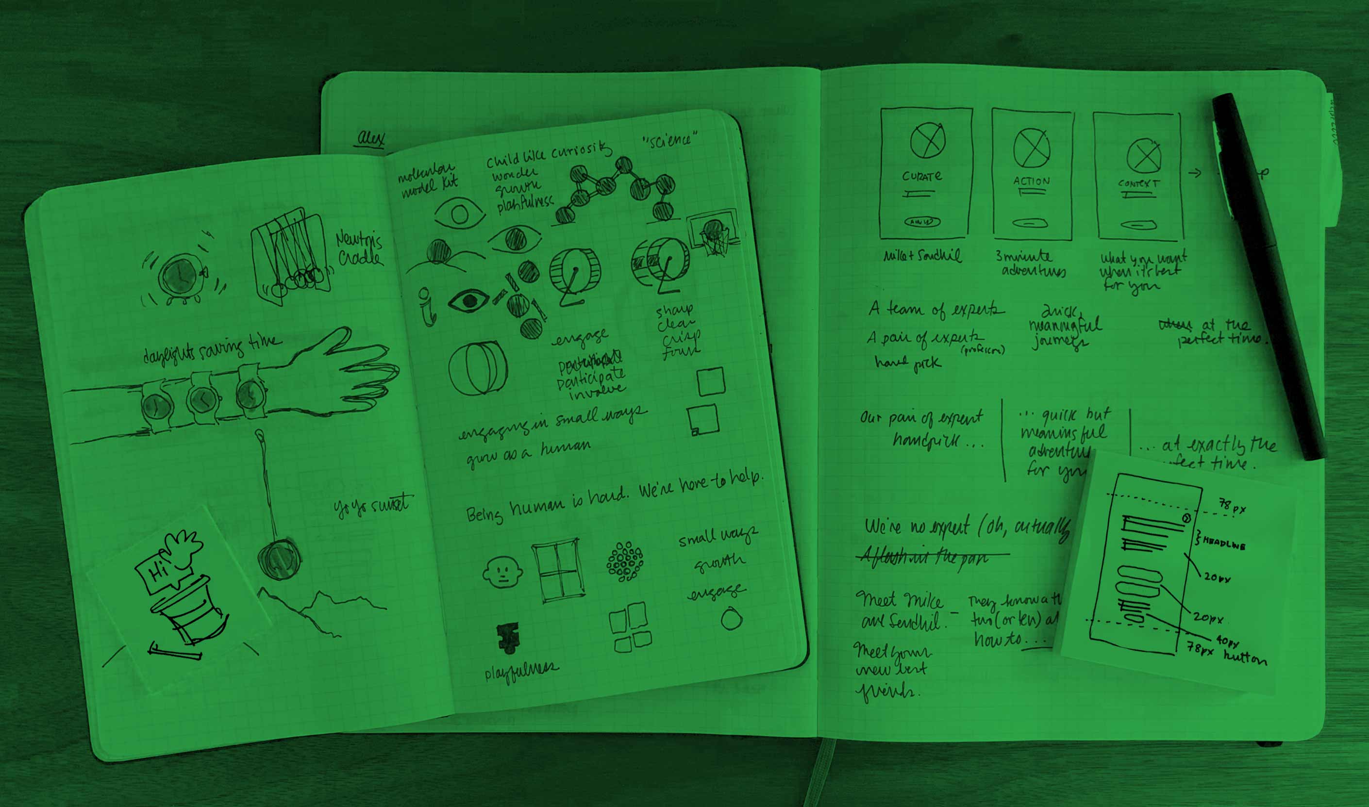
Pen and paper: Before creating even wireframes I sketched possible screen layouts and flows, as well as spot illustrations.
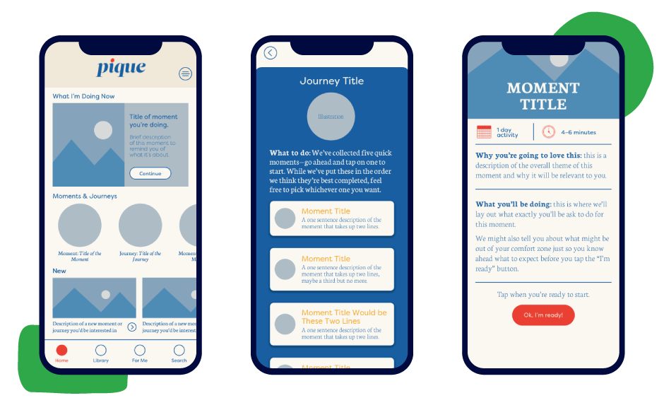
Homescreen and initial screens: wireframes options for homescreen, plus Journey and Moment screens
One way to keep content fresh was creating Moments that took users in a different direction than what they might have anticipate. Our Mother’s Day Moment did just that. At first we asked what users were doing for Mother’s Day (screen 1) but then steered the conversation towards them thinking of someone they know who has lost a mother, or someone who has a strained relationship with their mother. Through customized buttons, users were allowed to directly text or call within the Moment (screen 2) and then, as with all Moments, users were allowed to take notes and bookmark the Moment they just completed (screen 3).

Prototyping with InVision I was able to test with and then ideate new solutions before our beta release.