

Making Your (Second) First Impression Count
My Role: Competitive Comparison, User Flows, Wireframes, and UX Writing
Tools: Figma
Platform: Web (Desktop and Mobile)
Timeline: November 2023
New Name, New Look, Old User Flows
Latapult is a mapping software platform used by site selectors, land developers, and land analysts in large enterprise companies to help select the best land to develop for their building projects.
Latapult (previously Geothinq) rebranded in April 2024 with a new look and a new name. The brand update also created an opportunity to rethink their digital buyer journey. The user path created confusion and failed to persuade visitors to commit to a free trial.
One quick observation from stakeholder and customer feedback was that conversions were down, but lead quality was solid. Google Analytics showed that most pages had similar drop-off points, with the highest drop rate on the Residential Development page at 82%. The Registration page, where users selected their free-trial plan, had an 80% drop-off, with only 6% of users finishing the sign-up process.
I needed to look holistically at what similar products were offering, how Latapult’s new website could be optimized to move users into the sales funnel, and how to improve the free-trial user flow.
Paths to a Successful Sign-Up
Intro paragraph.
Check Out the Competition
To get an overview of this market and what competitors were successfully accomplishing, I conducted a competitive audit of three products: Land ID, Regrid, and Anderson Optimization.
I noted what similar products were doing well (and poorly) to convert visitors into customers. Focusing on how I could help users understand the value they were getting from their free trial, I noted several ways to improve the buyer journey. A similar product, Land id, clearly presents its offerings and pricing through clear language and easily scannable visuals. CTAs throughout their site stand out and are thoughtfully placed. Land id was also more successful at data capture compared to Latapult. Regrid’s offerings, on the other hand, are confusing. With multiple plan options and CTAs on a single page, and unclear visual delineation, users could easily be confused about what actions were needed to sign up. Anderson Optimization provides the least successful user experience of the competition. Pricing and plans are unclear and visually cluttered, and it offers no trial period. The UX language is also confusing and, at times, incorrect, and the main navigation CTA has functionality issues.
NOTE: show chart of comparisons
Optimize CTAs
Guided by these observations, I first wanted to improve Latapult’s global CTAs and price comparison landing page. Focusing on everything users encounter before customizing their free trial package would help educate potential users before they even start the sign-up process.
CTAs on Latapult’s current site were inconsistent. Consistent Free Trial and Get a Demo CTAs on key landing pages would better guide visitors into Latapult’s sales funnel. Swapping all newsletter sign-up modules across every page for Free Trial CTAs, and adding prominent CTAs at the top of pages, would ideally drive more conversions. Another key recommendation was to make the Free Trial page feel more like a landing page by reducing the number of links, which will help keep users on the path to signing up. Adding these CTAs on pages would ideally drive users successfully through the Free Trial funnel.
NOTE: image of Free Trial CTA baked into global top navigation
Another recommendation for the Pricing page was to list what each free trial tier includes, making it clearer that each plan upgrade gives customers more features.
NOTE: Show before screens and new Pricing page
With those recommendations cemented, I moved on to improving the free trial flow.
Show & Tell
Intro paragraph.
By the Numbers
The refreshed and redesigned website improved the overall user experience in several significant ways:
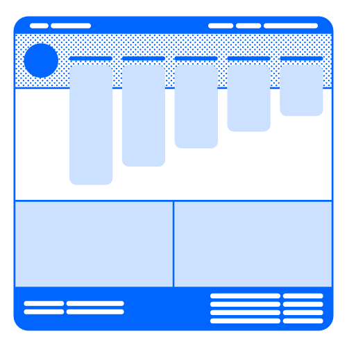
Optimized Nav + Expanded Footer
Main nav updated to 5 organized categories, while the footer is now expanded into 4 labeled categories
All get-involved actions
for users are now organized
from 2 separate menus into a single dropdown
Consolidated
IRL Events

All modules throughout the site now share a design system, removing styling inconsistencies