
Making Your (Second) First Impression Count
My Role: Competitive Comparison, User Flows, Wireframes, and UX Writing
Tools: Figma
Platform: Web (Desktop and Mobile)
Timeline: February 2024
New Name, New Look, Old User Flows
Latapult is a mapping software platform used by site selectors, land developers, and land analysts at large enterprises to help them select the best land for their building projects.
Latapult (previously Geothinq) rebranded in April 2024 with a new look and a new name. The brand update also created an opportunity to rethink their digital buyer journey. The user path created confusion and failed to persuade visitors to commit to a free trial.
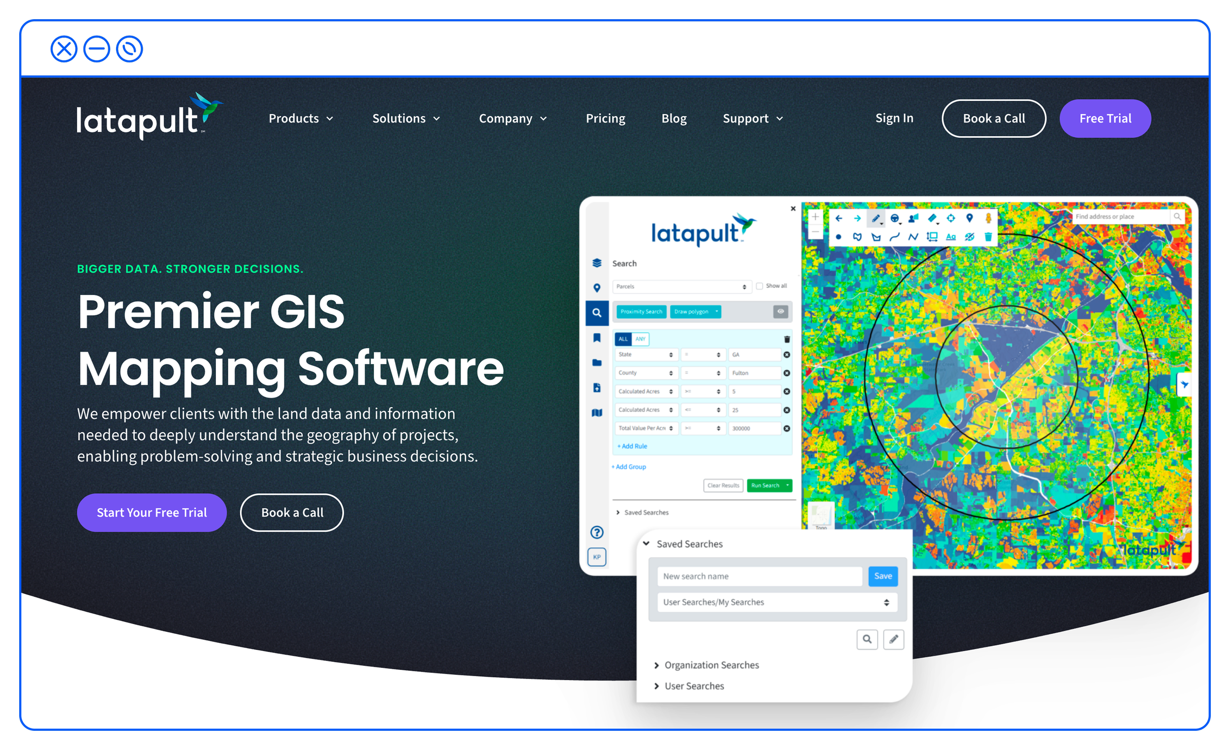
One quick observation from stakeholder and customer feedback was that conversions were down, but lead quality was solid. Google Analytics showed that most pages had similar drop-off points, with the highest drop rate on the Residential Development page at 82%. The Registration page, where users selected their free-trial plan, had an 80% drop-off, with only 6% of users finishing the sign-up process.
I needed to look holistically at what similar products were offering, how Latapult’s new website could be optimized to move users into the sales funnel, and how to improve the free-trial user flow.
Digging Deep
Before rethinking the buying journey, I wanted to see how similar products handled new user flows and where I could optimize calls to action to create a frictionless experience for potential sales leads.
To get an overview of this market and what competitors were successfully accomplishing, I conducted a competitive audit of three products: Land ID, Regrid, and Anderson Optimization.
I noted what similar products were doing well (and poorly) to convert visitors into customers. Focusing on how I could help users understand the value they were getting from their free trial, I noted several ways to improve the buyer journey. A similar product, Land id, clearly presents its offerings and pricing through clear language and easily scannable visuals. CTAs throughout their site stand out and are thoughtfully placed. Land id was also more successful at data capture compared to Latapult. Regrid’s offerings, by contrast, are confusing. With multiple plan options and CTAs on a single page, and unclear visual delineation, users could easily be confused about what actions they needed to take to sign up. Anderson Optimization provides the least successful user experience of the competition. Pricing and plans are unclear and visually cluttered, and it offers no trial period. The UX language is also confusing and, at times, incorrect, and the main navigation CTA has functionality issues.
Surveying the Competition
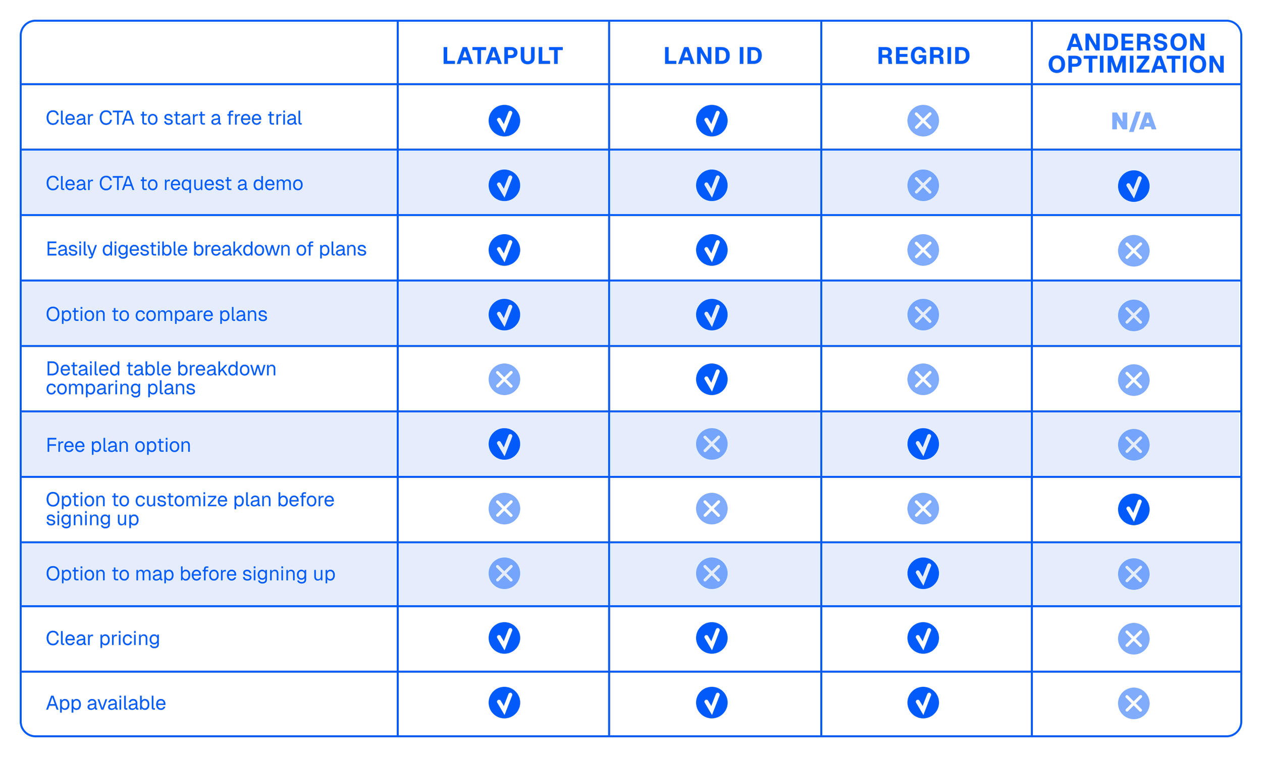
Guided by these observations, I first wanted to improve Latapult’s global CTAs and price comparison landing page. Focusing on everything users encounter before customizing their free trial package would help educate potential users before they even start the sign-up process.
CTAs on Latapult’s current site were inconsistent. Consistent Free Trial and Get a Demo CTAs on key landing pages would better guide visitors into Latapult’s sales funnel. Swapping all newsletter sign-up modules across every page for Free Trial CTAs, and adding prominent CTAs at the top of pages, would ideally drive more conversions. Another key recommendation was to make the Free Trial page feel more like a landing page by reducing the number of links, which will help keep users on the path to signing up. Adding these CTAs across pages would ideally guide users through the Free Trial funnel.
Differential Positioning of CTAs
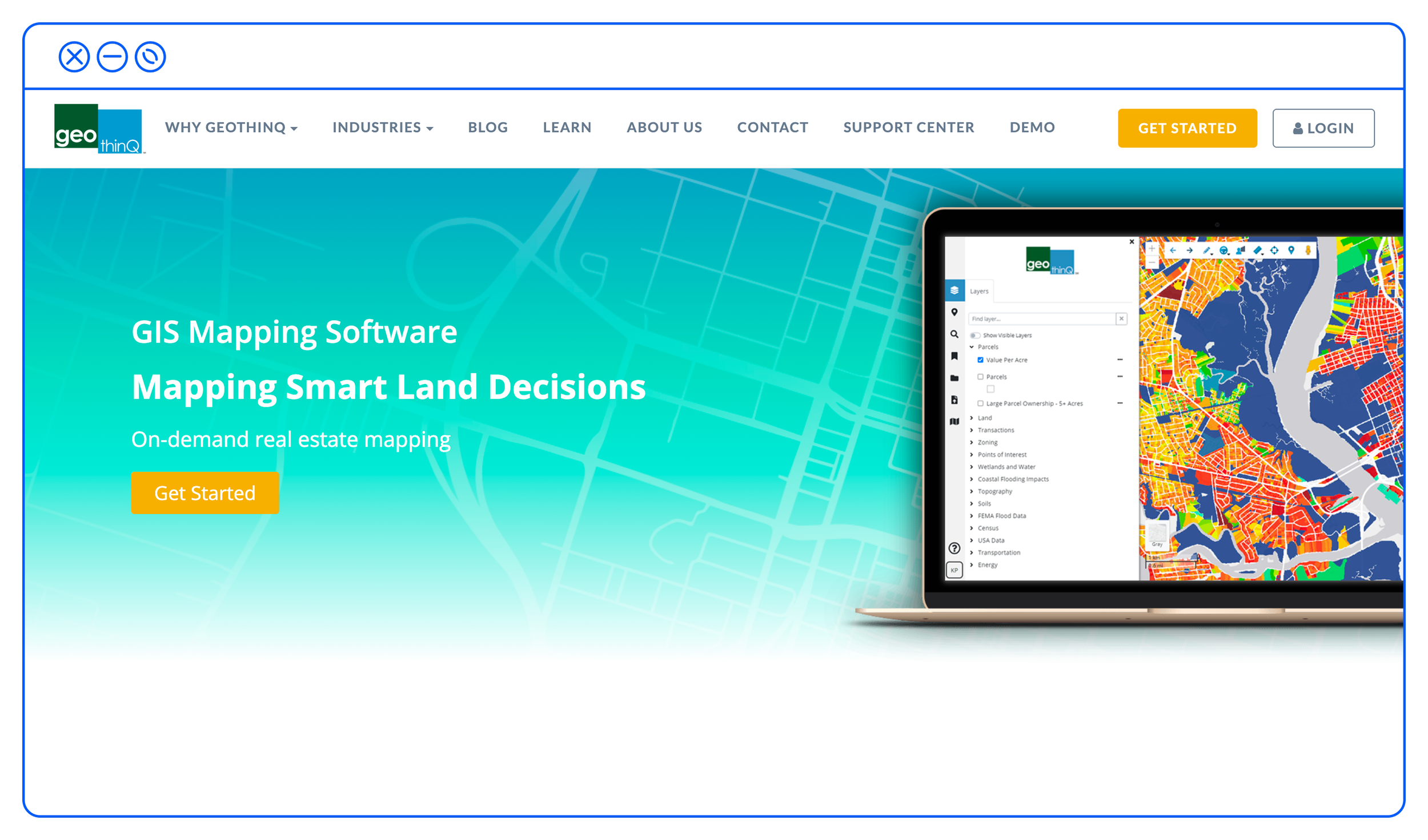
The old homepage’s two main calls to action, “Get Started,” were unclear. By rethinking the top nav buttons with clear, actionable UX language (Book a Call and Free Trial), users would instantly know what journey they would start upon clicking either. Duplicating those two main CTAs in the homepage hero reinforced the two most popular options for potential customers.
Making the Free Trial button a prominent global feature across the site would let visitors start the Free Trial from anywhere during their visit.
Another recommendation for the Pricing page was to list what each free trial tier includes, making it clearer that each plan upgrade gives customers more features.
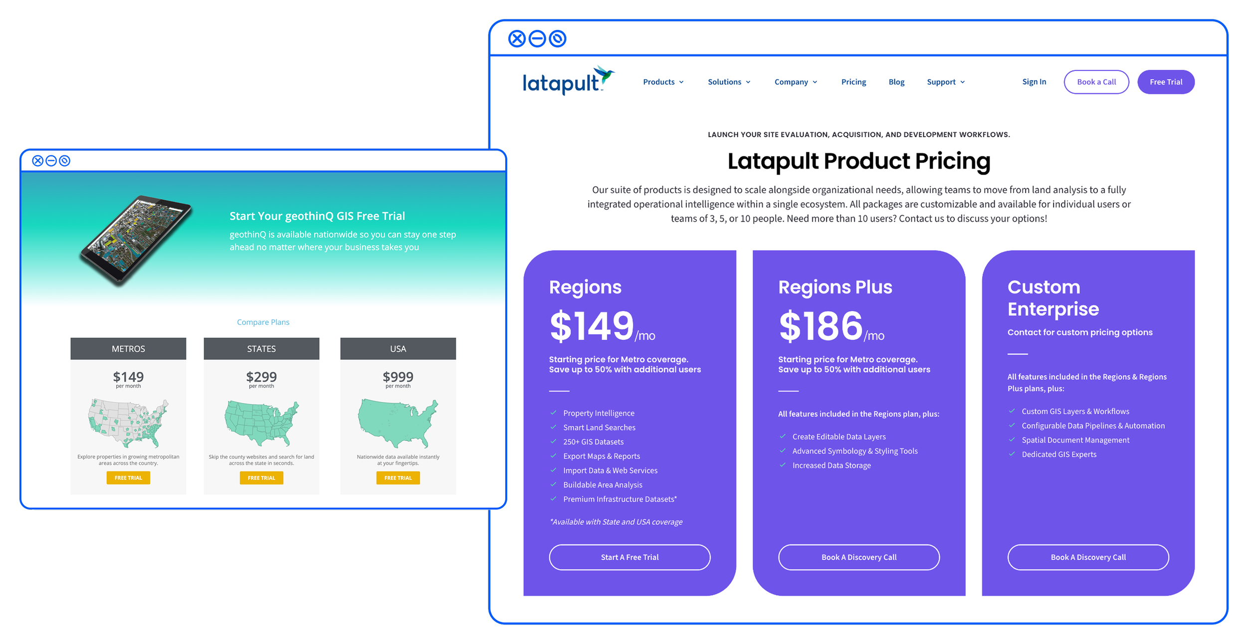
Above are the original Pricing page and the new Pricing page, with bulleted lists for each plan so users could choose the option that best met their needs.
With those recommendations cemented, I moved on to improving the Free Trial flow.
Optimized CTAs across the site to guide visitors through the Free Trial sales flow and improve the user experience.
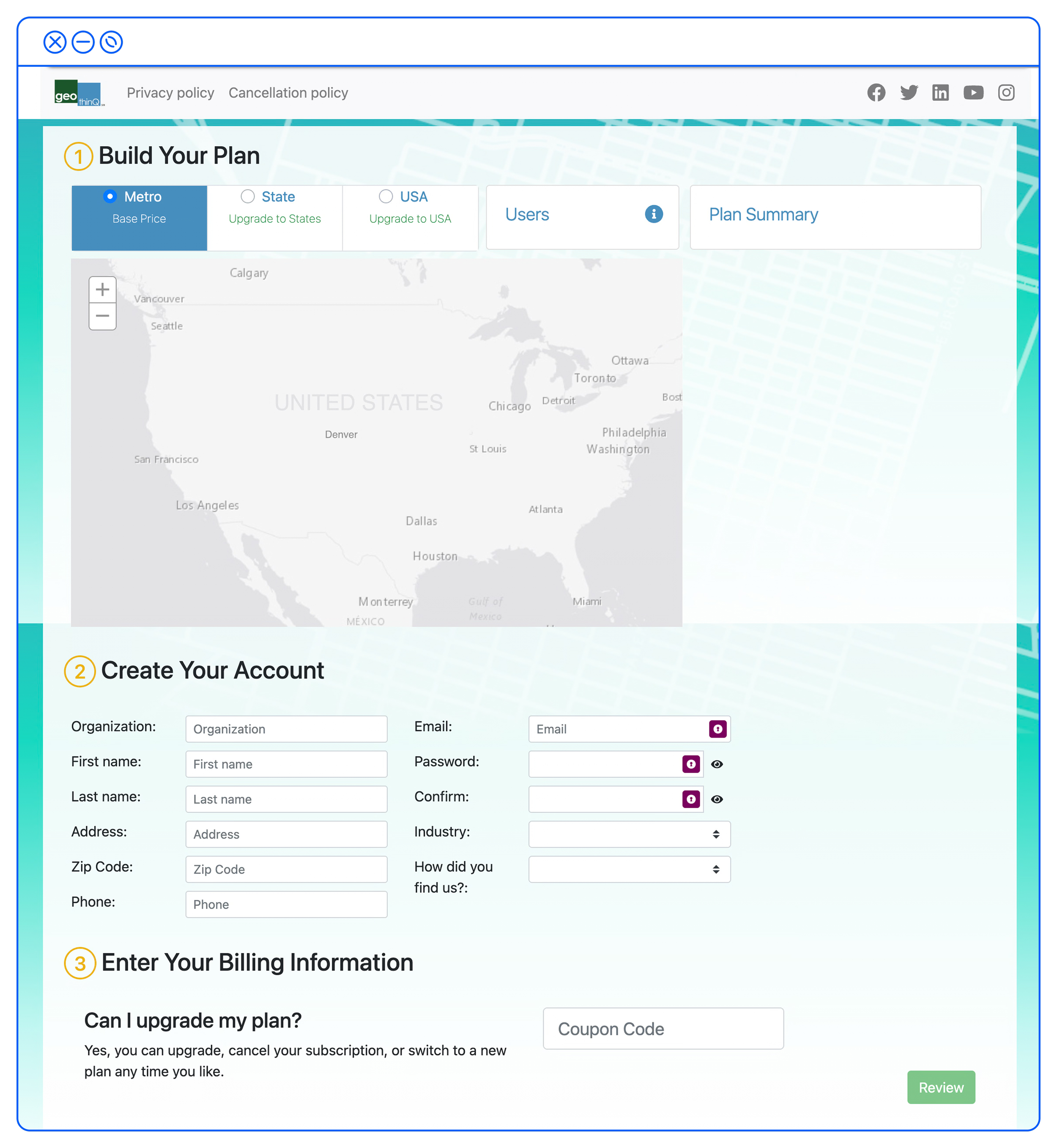
The current Free Trial page was visually clunky and outdated, showing only partial information and not guiding users to the right subscription plan.
Also, putting all steps on one page reduced users' ability to focus on each step to complete sign-up.
Elevation of Purchase Flow Information
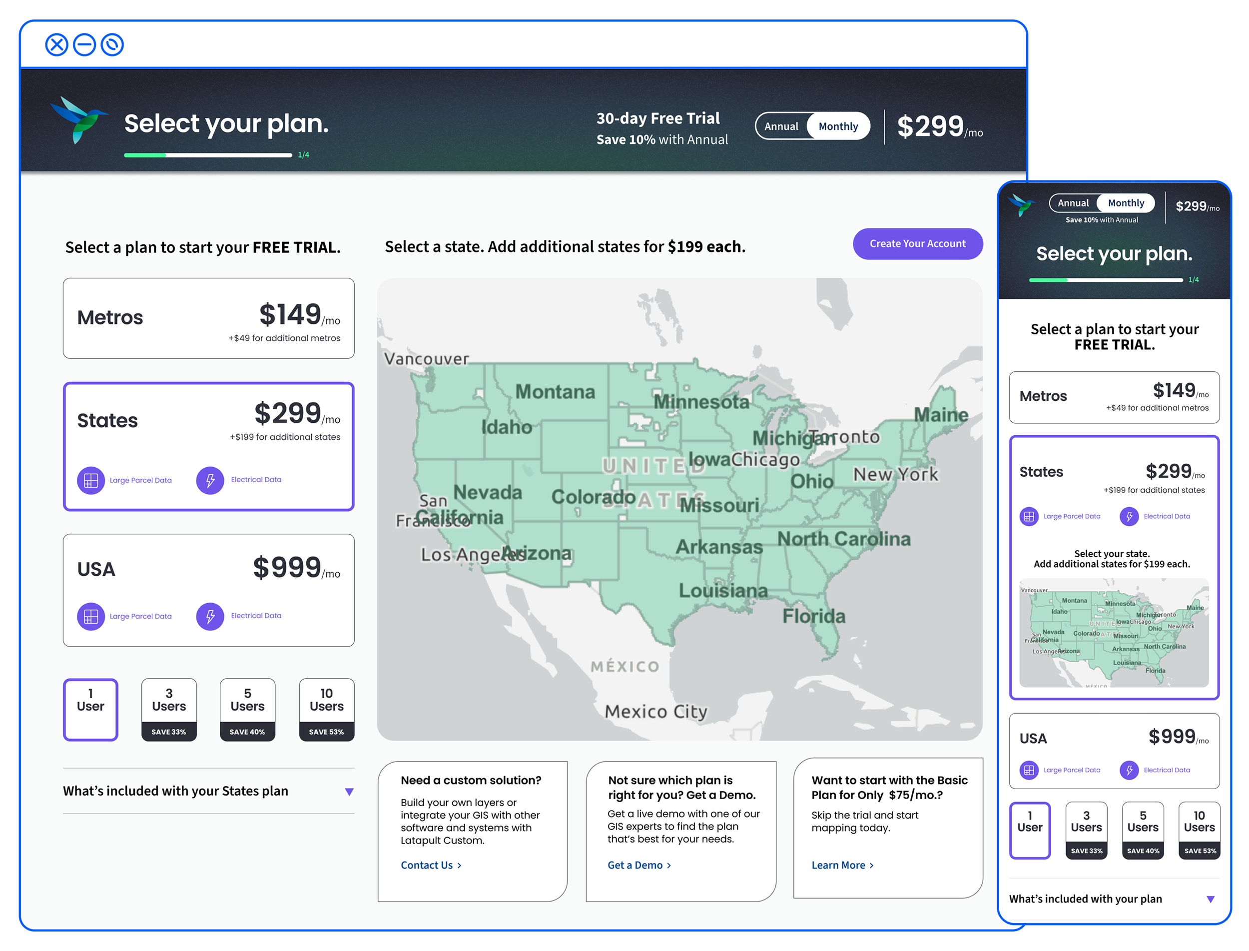
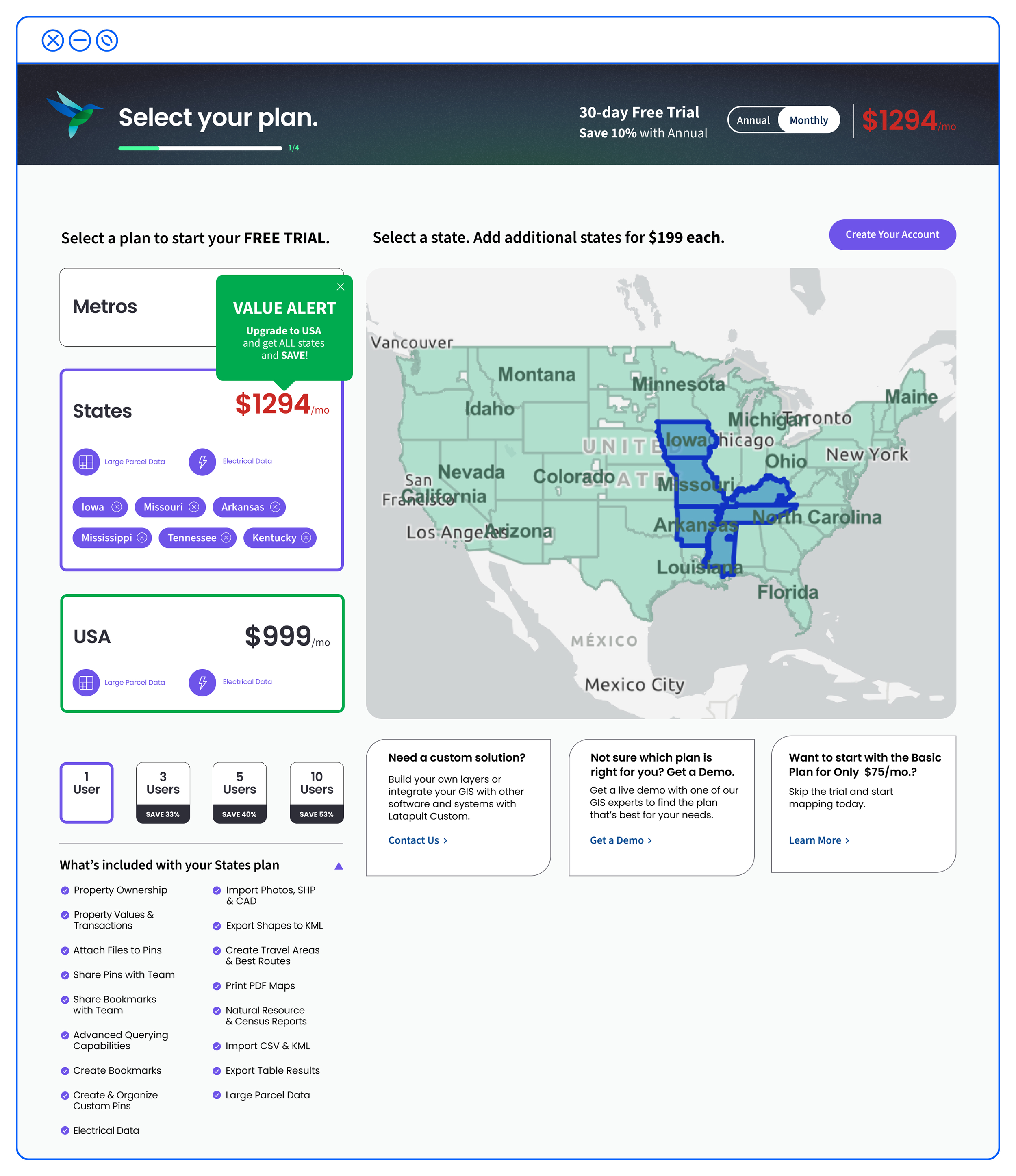
Using the new design library, I created the start of the purchase flow, reorganized the content hierarchy by moving plan options and content to the left, and placed the map in its own column. I also moved pricing to a top-of-page bar that dynamically updated based on the options users selected.
Another opportunity was to show the added value of each plan upgrade with modals that guide users to savings and an expandable bulleted list of features based on the current plan selection.
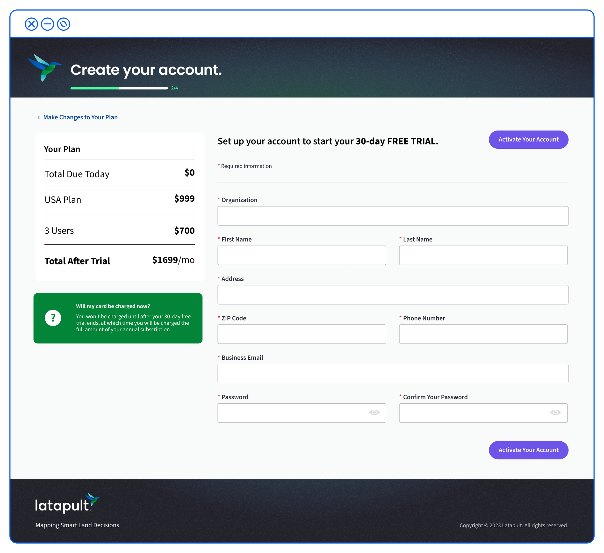
Once users chose their personalized plan, the itemized selections appeared on the checkout screen, with the option to go back and change their plan.
After testing the new flow with stakeholders and ideal users, we added a 3-up module below the map to account for edge cases.
This helps if users don't find the exact plan they need, want a demo, or need to compare plans again.
Stakeholders also insisted on the monthly subscription being the default, since that option tested best with customers.
Benchmark of Success
We paired the new flow with an SEO-focused marketing campaign that increased demo signups to 50 in the first 6 weeks, helping users feel confident choosing a plan and starting their free trial. Through targeted ads and an improved sales flow, conversion increased 159%, with a 300% increase in site visitors.

158% surge in conversions

300% more site visitors